Showing posts with label art. Show all posts

Saturday, 25 April 2015

Screenshots 25-04-2015


I've had a lot of difficulty getting the game "finished" this month for a few reasons, the most obvious setback being losing the initial programmer.  However the final code is in (I managed to rope a programmer I worked with on Ubiquity/Duality to help) as is the audio and other than that I've just been been polishing this month and working through the issues with my art I brought up in my last post.

I'll make another post after this with gameplay footage along with some of my final thoughts on the project however for now I wanted to talk about how I tackled the sort of art block I was having.

Menu Screen 


The primary typeface I've been using for the branding of the game is an opensource font called "Figa" which I've edited to be a bit more readable.  I decided to keep the menu screen pretty simple as I want the focus at the showcase to be on the actual game.  However in retrospect I should have experimented a bit more.  

Forest Area


In my last post critiquing the game as a whole I addressed the issue of my tree designs potentially being too bright for a horror game.  However I felt having darker trees felt a bit too visually harsh and lightened them again, though the trees do become ever so slightly darker the closer the player gets to the school.  I've also lightened the background slightly, added more white mist and lowered the opacity of the flickering vignette overlay so it's a bit more subtle.  Another important change to the game as a whole is the addition of a letterbox overlay.  I really like how cinematic this makes the game feel and even though it's not that noticeable I think it's just a nice touch.


I've also added in some spatial tutorial elements which I'm quite pleased with - I'm going for a clean but glitchy aesthetic to compliment the finale of the game.

Hallway


The hallway is looking a lot better although I'm still not totally happy with it and can't really put my finger on why.  The colour scheme is a bit dull despite the little splashes of purple and teal I tried to include to avoid that and the scrolling fog looks a bit too solid.

Basement Corridor


Blurred the background and added a low opacity black overlay on top to make this area seem darker and eerier.  I've also added some little hand prints in the background to lead the player to the "Ritual Room".

Ritual Room


The most important addition to the ritual room has been the feedback animation to be triggered after the player presses space and "activates the ritual" i.e. timed gameplay sequence of closing the three portals.  Ideally I would have animated the player character doing something such as touching the red stain on the floor however I ran out of time.  Instead the ouija board in the background begins to glow slightly (this glow was way more obvious in previous iterations and as a result looked really tacky so I toned it down), the salt pentagram on the ground begins to pulse a sort of red glow and a demon arm will appear to try and grab the player as a sort of warning for the chase sequence that happens once the player leaves the room.  I also tweaked the candle layout (sooo much of my time in the level editor this year has been spent tweaking candle arrangements!) though it could probably do with a few more just to really kick up the cult-y vibe I'm going for.  I've also added quite a few bespoke animations that the player will trigger in this area such as blinking eyes in the hole in the wall, rats running across the hanging chain and the china doll in the background falling to the ground for no reason.  I think these really help add to an unsettling atmosphere and those who have played the game have commented that the doll in particular is "pretty creepy".

I'm really not happy with how the ouija board turned out, it looks a bit bland.  If I have the time I might change it to look like a more traditional ouija board that's been nailed to the wall.  Aside from that though I'm satisfied with how this area has turned out.  I fixed the scale issue by messing about with the size of the wall in the background, making the room a bit shorter and enlarging the foreground asset so that the enitre scene feels a bit more claustrophobic.

Classroom


I'm pretty satisfied with this room too although the environmental storytelling isn't as chaotic as I initially envisioned.  However sticking to a colour scheme of teal and rusty reds worked really well I feel as it doesn't feel too overpowering yet is still murky enough to pass for horror.

Limbo


I intentionally didn't add the letterbox overlay to this area as the finale of the game is where I wanted the fourth wall breaking elements to come in to play.  I didn't have time to implement this quite as I'd like to have although I think the uncomfortably bright colour scheme and glitchy animations game out really well.  The "tree ghosts" come across a bit forced though and their blobby, shadow designs aren't exactly scary.  If I'd had more time they'd be a lot more complex. I've also had people comment that the game ends too soon after the brother character is taken by the enemy.  Ideally I would have had a sort of cutscene at this point showing a more emotional reaction from the two characters once they see eachother and then the enemy running at the player after it consumes the brother, with the screen fading to black just before it reaches the player.  I also wanted to include some sort of enemy slowly creeping towards the player as the game begins to slow their movement which I feel would have really added to the tension.  However once again, I've ran out of time to do a sufficient job on that.

Overall I'm not very happy with this area.  The layout in general just seems a bit stale.  I think I might mess about with the foreground assets and add some more fog in an attempt to get that claustrophobic atmosphere back.
--

Degree Show Exhibition and Poster Design

I've been busy designing a poster for my game to be shown at the degree show next month.  I started by looking in to commercial posters for both horror video games and film.

I definitely prefer the more minimalist approach as it ties in with the idea of playing with the viewer's imagination which has been fundamental in my approach for creating atmosphere in my project.  However I feel Ritual is obviously not distinct enough to pull off something as minimalistic as the Evil Dead poster above.  I love the idea of incorporating moody lighting such as that depicted in the Alan Wake poster and I also love the hyper contrast of The Blair Witch Project poster.  The Evil Within poster also makes great use of negative space with just the right amount of gore.

After some super rough sketching of ideas I then moved on to creating some polished thumbnails and asked people what their favourites were. 


Most people seemed to prefer 6, saying the composition was simple but effective and withheld enough information for them to be both interested and creeped out.  


I gave the first iteration (above) to an artist friend who gave it a really useful paint-over which led to my second iteration which I posted online for the internet to tear in to:


General crit:
- It looks like the boy is being hanged (bit too edgy for a student exhibition, oops.)
- Add some rocks and mud etc coming off him to show he's floating
- Shoes are too dark and act as a focal point as a result
- Make the trees at the side more curved to give the composition an ovel shape
- Add a black overlay to the boy to give him more mystery
- Make the "May 2015" type smaller or change it to the primary typeface.
- Typeface is too clean in comparison to the illustration
- Add a splash of colour for more visual interest
- Add smoke or fog around the boy to give him more substance and suggest a light source

Still playing about with colour however this is the latest iteration (will edit this post with the new one when it's finalised):

I've also been considering the general layout for my degree show space.  Below is an example from last year of the space I've been allocated.  I really like how Rebecca included the decorative mirror fragments here as it gives a nice sort of personal touch (as opposed to just sticking up a bunch of posters and leaving it at that) however I can't really think of anything appropriate in relation to my own project.

I've made the following mock up of how my posters will be laid out (A2 portrait for the main poster, A4 landscape for the rest with an A5 sheet underneath the main poster describing my project):

At previous degree shows I've noticed that the mounted posters always stand out the most and look a lot more professional so I really want to do the same for mine.  All my images will be mounted on 5mm foam mount and I'll hopefully have a little stand for a sketchbook and business cards.  The images I've chosen to showcase will be displayed in chronological order from top to bottom, beginning with early art test examples, concept art and finally some screenshots of the game.  When we were showcasing Strawberry Thief last summer at Protoplay festival, Sophia ordered Strawberry Thief printed fabric to hang over our stand and underneath our poster.  It was simple but effective and I think adding this sort of extra element to a display can look really classy.  I'm hopefully going to be able to purchase a small sheet of black chiffon fabric to hang over the stand I want to put my sketchbook and business cards on but honestly it depends on my funds (fourth year/graduating is hella expensive.)

The biggest issue I'm having at the moment is all of my test prints are coming out super dark.  I've had a similar issue with my business cards too (see the designs below).  Despite them coming out fine in previous test prints before sending them off to moo.com, the designs turned out super dark and I'm really not happy with them.  I also didn't factor in time for self branding, choosing to focus more on Ritual and its promotional materials for the showcase.  In retrospect this was a mistake as I'm supposed to be selling myself as an artist rather than the game as a commercial product.  However for future ventures in to business card design I've learned to stick to brighter, more print friendly colour schemes.  After getting some feedback on previous iterations of the current card design someone also suggested I include more whitespace for people to potentially write on.  I considered this however as these designs are solely for the purposes of the degree show (like I said I'd much rather develop a brand for myself than simply throw some old concept art on a card) I felt it wouldn't be too much of an issue.  On a similar note, I'll also be much more considerate of my general layout next time (because look at how boring it is and how off-centre my information is, urgh!).

So yeah, printing-wise I may have to heighten the white levels like crazy in all my images and just hope for the best when I send them off.  As most of my work been digital this year the majority of my sketchbook will have to consist of printed off images which I imagine will have the same problem.  I'm sure I'll find a way around it.  Probably.


Finally, I should also mention that I have a website now!  I'm quite pleased with how it turned out - I wanted to keep it quite minimal and the geometric shapes look clean and neat and I feel my current branding works really well as header.  Though on the other hand, the sides look pretty empty and would maybe benefit from some sort of subtle background element.  Definitely want to develop a more in-depth brand after graduation.


Thursday, 12 March 2015

Ritual Build 11-03-2015


This is the build for "Ritual" as of 11-03-2015.  Excuse the dodgy frame rate, my laptop apparently can't handle screen capture software.

I'm pretty disappointing with it to be quite honest.  I feel like my art hasn't improved at all since first semester and if anything has gotten worse,

Forest area

I got some feedback from a friend who saw a previous build who pointed out the trees are too bright for a horror game.  I've darkened them here but I feel like they create too much contrast now.  Perhaps a sort of dull, greyish purple will work better.  I'll have to experiment.  It also feels a bit too cluttered so I'll play about with removing some assets and see how it feels.  I also still need to tweak one of the tree assets that looks unnaturally straight.

A few people have pointed out the flickering overlay is uncomfortable on the eyes, however these folks have only seen the video with the temperamental frame rate and everyone who has played the game so far has found it appropriate.  However one person who played the game did say the flickering isn't random enough so I'll try work out a way to have it randomly flicker.

Hallway

Obviously quite bare at the moment due to being a work in progress however I feel it would really benefit from some blurred foreground assets in order to give a better sense of enclosure and isolation.  I've also thought about adding a letterbox frame to the game for a similar reason.  Won't be too hard to mock that up to get an idea. The floors are also maybe a bit too bright and should at least be darker nearer the top of the asset to give a better sense of depth.  Perhaps I could add a bit of subtle perspective to the asset itself too.  I also find the doors don't exactly scream "school" so more iteration is required.  Also not sure if that purple colour is really working, seems too "pretty"... May have to rework my colour palette for this area again.

Basement Corridor

I think the flickering works well here and could maybe do with being totally dark at certain points to take more visual information away from the player as they're being chased by the enemy.  Also need to make it more obvious you have to press space at the ends of the corridor to enter and exit.  The neon graffiti should have a glowing animation or something just to give the room a bit more life.  Might be interesting to experiment with tilting the floor at an angle however I'm not sure how this would work via code with the player walking horizontally.  The pipes in the background also seem a bit "stuck on"  will have to create a bunch of other subtle assets to integrate them better.

Ritual Room

Really not happy with this one.  The entire scale just seems a bit off.  I showed the concept art for this to Ryan a couple weeks ago and he pointed out the composition as a whole needs more diagonals to break up all the straight lines.  I feel the skirting board I've added to the bottom of the wall is a major part of the problem as it's too big for the scale and thus visually confusing and also breaks up the image too much.


I think the portals look nice though!

Next Steps for art asset creation
- Finish hall assets/tweak current layouts
- Play about with character scale
- Polish overlays
- Feedback animation/tutorial for Ritual area
- Bespoke animations

Thursday, 19 February 2015

Colour Script

After stuggling with colour schemes for my game and creeping on my friend Jess' honours blog I've been inspired to create a colour script for my game.

I really liked the example of the Journey colour script she posted and how it portrayed the colour palettes along side the basic shapes of the environment to help really push the mood that area was trying to achieve:


I also really liked this example of the colour script for The Incredibles and how complicated scenes are simplified in to geometric shapes:


And this is my first attempt at a colour script for Ritual:


I wanted to start of the game with a relatively "safe" colour scheme of light greens and purples mixed in with gritty darker shades to create a sort of gritty, grungy look.  In the school area there will still be "safe" light blues however the colours will start to shift to a darker and more sinister palette.  The corridor on the way to the ritual room will be very dark with lots of black overlays to obstruct the players view, literally keeping them "in the dark", with breaks of neon graffiti to serve as uncomfortably bright warnings.  The ritual room itself will be dark and red to symbolise danger and rooms with portals hidden in them will also make use of dangerous and dark palettes.  Finally, the alternate dimension which the climatic event of the game will take place in will make use of unsettling, saturated colours set off with grim black and white tones.

However I want to experiment a bit more with the colours before I finalise the script so here's some alternate thumbnails:

Hallway and Forrest 

For these I just played about with the hue of the overall thumbnail.  The first thumbnail for the hallway here looks a bit too bright and surreal though.  The other two look a bit more gritty and menacing in comparison to the original light blue thumbnail however, which is a lot more fitting for the game.


A rusty, red forest looks pretty cool however might be straying away from the relatively "safe" colour scheme I want at this point.  I also really want the initial forest to really contrast with the weird and jarring colours of the "limbo" forest environment at the end of the game so sticking to a relatively normal colour scheme might be a good idea.


Limbo

I really want the limbo environment to have a super uncomfortable colour scheme for the player, so lots of over saturated colours mixed with sinister blacks is what I'm going for.  I can't decide which one might work best though.


The inverted colour scheme idea came about when I was messing about with overlays in the game and accidentally broke it.  I took a quick clip of it which you can view here.  I really like the idea of glitching the game at this point as it messes with the relationship between player and game - the horror of the game is so real it reaches beyond the player character and messes with your graphics card!  A mechanic along the same lines as this was used in Eternal Darkness: Sanity's Requiem where the player character was given a "sanity meter" and if it became too low the game would act as though it was deleted all the saves off the player's memory card.  This is a concept I'm really interested in and it would be really cool to explore it in my own game.


Monday, 9 February 2015

Gameplay Footage 04-02-15


Gameplay footage of "Ritual" as of the 4th of February.  Currently everything is either placeholder or 1st pass at best.  It's not pretty but it's coming together slowly.

I've mainly been messing about with getting things to flicker on screen for one frame at a time and trying to get sounds to work.  Later the flickering images will become increasingly obvious, along with more aggressive SFX, leading to a climatic event of a chase sequence which will happen after the player triggers the portals.

I'm currently experiencing an issue where my WAV sound effects are distorted.  I looked it up and apparently it's a Game Maker bug.  It'll be such a shame if I can't get it sorted as my sound designer's worked really hard on them.  Game Maker is unable to play two MP3 files at once hens why I've had to use WAV files for the SFX (the BG wind noises are MP3).  However in the final version of the game there will only be background sounds in the forest so hopefully this won't be an issue for the rest of the sound effects.

However aside from that little hiccup the player can now interact with the "portal trigger" object (which in the final version will be a sort of spell detailing a tutorial) and interact with the three portals that pop up using space to close them.

Next week I'll hopefully have the time limit working with a countdown HUD in place.

More Concept Art - Portals, Wall Markings and Player Character


I've started taking a more Child of Light sort of approach to my pipeline in that the concept art for the game becomes to actual art assets themselves.  It works well and is very time efficient - Provided I remember to organise my layers correctly!  So here's some concept art for the portals and wall markings in the game.  I felt having bloody writing on the walls was a bit over done and (perhaps inspired by Infamous Second Son which I played recently) went for this sort of saturated, neon sort of look.  I thought it might be interesting to cross this with satanic imagery - a sort of neo-satanism aesthetic?  


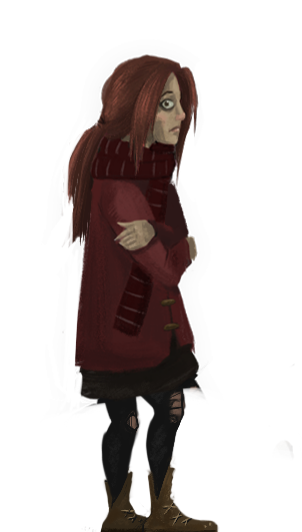
These are some silhouettes I did when designing the player character for the game.  I spent far too much time on them.  Need to remember to keep my lines on my silhouette work quick and easy!


In the end I ended up with these three designs and picked the left design,  I felt the coat created the most interesting shape.  I also tried to stick to warm colours in order to contrast with the cold environments.

Player Character Animation


So this was the first pass for my player character animation.  There was a lot of issues with this version - It's very jerky and there's also too much bounce in her step.  Her legs are also weirdly placed as they're too far forward.


And this is the current version in game.  It's ok.  Still feels a little jerky and her scarf moves quite unrealistically however I'm quite pleased with how the overlapping action of her hair turned out and the general pacing feels alright.  Ideally I would have her looking to the side as she walks occasionally however time is marching on so I'll add that to the non-priority list!
  

I've also added a simple idle animation based on the above pose.  Super simple, just her blinking occasionally - but as I learned from the Global Game Jam, even just a simple animation like that in the idle makes a world of difference.  If I have time I'll work on it more, maybe add her shivering or something.

I'm also currently working on a run animation as it's currently very tedious to navigate the game environment at a walking pace so a running option felt necessary.

Tuesday, 27 January 2015

Global Game Jam

Last weekend I took part in the 48 hour Global Game Jam.

This is the second game jam I've taken part in and I've found they are a fantastic opportunity to work on artistic areas outside my comfort zone and thus improve skills I'm lacking in.  Animation is an area I really struggle with so I jumped at the opportunity to flex my character animation muscles some more during GGJ!

My awesome team Blank Canvas (formally Richard & The Nigellas) hard at work.
First off I'll talk about our general process.  

The theme was "What do we do now?" which initially left us thinking up ideas for a strategic survival game inspired by Don't Starve however after much serious discussion we realised it didn't sound fun and decided to kill it.  We then came up with various hide and seek inspired ideas but couldn't really think of ways to add meat to the gameplay so we killed those off too.  By midnight we were all starting to flag and debated going down the "interactive narrative route" however after an hour of discussion decided that was also too boring.  At 1 AM things took a pretty dark turn after someone brought up the idea of kids and imaginary friends and someone else yelled something about an imaginary friend being the dead friend of the kid.  

That's when we came up with the concept for "Revenant" - a short, local multiplayer puzzle platformer game where one player plays as a little girl searching for her friend down an abandoned mine shaft and the other plays as the ghost of a little boy she meets there.  The girl character can shine her torch on objects to allow the ghost character to interact with them and the ghost character can interact with "ghost objects" to bring them in to the real world for the girl to use.  After solving a puzzle in the game players will discover the body of the little boy's ghost and the screen will fade to black as the text "What do we do now?" appears.  Yeah, things got pretty grim.  

With the clock ticking and the team deciding we wanted our main characters to be children, I showed the guys my concepts for the little brother character for my honours game.  They really liked the style so I decided to go for similar proportions but with the flat textured art style that myself and Stuart, our other artist, like to go on about so much whenever we do game jams. 


I didn't bother with any silhouettes or any of the other techniques I usually employ in my character design process and just went ahead and churned out the designs.  I'm pretty pleased with how they came out considering.  (However I did add a penguin silhouette to the little girl's dungarees, a little Easter Egg from our last game jam game Gentoo.)


In this idle animation the blink is way too fast and I got careless with certain frames (the accidental brush mark on her legs around the time she blinks.) It's also just generally too static and could benefit from overlapping action such as a nervous hand twitch or a subtle turn of the head.


The animation here is super janky in this walk cycle.  The hair bobs/flicks too late (it should be bobbing up at her shortest point and down for when she reaches her tallest point) and it could do with a couple more in-betweens to smooth in out.


The ghost boy's idle suffers from the same issues as the little girl's.


And in his walk cycle he appears to changes sizes slightly in a couple frames as does his horizontal position.  This was the result of careless Photoshop work on my part.  Next time I'll take better care (and also not animate after just a couple hours sleep I spose.)  Atleast the actual motion of his legs came out a lot smoother than the girl character.

I also worked on a couple animations for climbing and turning cogs however they were the result of just a couple clunky last minute frames so I won't bother critiquing them here.  However you can see them in action in the following video of gameplay footage:


Despite their flaws, working on these animations has left me feeling much more confident about working on the character animation for my honours project.  I recently completed the first pass animation for my main character (which I'll make a post about soon) and I now have a better understanding of how to improve upon it for the 2nd pass.  For instance I was having issues with how far apart the highest and lowest points of the character's gait should be space and experimenting with these animations during the jam has helped me determine the correct heights.

All in all, the game jam was a fantastic experience and I'm really proud of what we achieved in such a short amount of time.  Can't wait for the next one!

Click here to download our game!

Friday, 26 December 2014

Character Design - Brother


Initial character silhouettes.  I preferred the silhouettes with larger eyes and heads as the character has to instantly convey their emotion to the player which will be more difficult to achieve with realistic proportions. However I don't want to risk pushing these proportions too far as I could risk the designs becoming unappealing (as seen in the character design in my previous concept art post.)  I want the brother character to come across as fairly young and innocent which is also easier to achieve by using the wide innocent eyes of this design.


Some variations of the final designs.  I personally like the variant on the left best as he still looks young enough to be quite cute and innocent however the glasses make him appear old enough to be adventurous and go off exploring (and thus get in to all kinds of supernatural trouble his sister has to save him from.)

Concept Art

These are a few pieces of concept art I've done for the project so far.


I started this one a lot earlier in the year and tried to establish the overall mood of the game.  I was quite stuck on how to approach the character design proportion-wise.  I didn't want to aim for realism as I feel that's a bit pointless in 2D games which have so much potential for stylistic art.  The eyes are definitely too large and exaggerated here though.  I've also really noodled in to the textures of the character and completely overdone it.  I think next time I'm painting skin etc and my blending starts becoming muddy I'll just start over that section again.

Lighting the scene was also difficult.  There was potential for a lot of really dramatic, contrasting lighting and I feel I've rendered everything too dull.

I've also added too much detail to the trees in the distance and failed to portray the atmospheric perspective strongly enough.

For the ground I experimented with using the polygonal lasso tool which I think came out quite well - the sharp edges created using this technique contrast nicely with my rough, gritty brush strokes.


In this one I was trying to explore how the exterior of the school would look. It had to appear ominous, old and be relatively small in size.

I also really struggled with the lighting on this one.  The lighting is far too light and subdued for the night time scene I originally intended.

There's also something a bit off about the level of blur on the fence compared to the tree on the foreground.  I feel the scene would look a lot more believable if I made the fence slightly more blurred to match.

The rendering of the stones on the building also looks very rushed and I should have taken more care and found better reference.

The building itself also appears quite flat.  Drawing the building at a different angle instead of front-facing may have helped.

However I feel the trees in the background turned out nicely, as did the jagged slabs (created using the polygonal lasso tool again) of the pathway.


In this scene I was experimenting with the scale that could be used in game.  I also tried to be more adventurous with lighting.  In the scene I wanted to use lighting to direct the player to potential hiding spots (in this case the lockers) via a potential hole in the roof letting moon light through or an old flickering light on the ceiling.

I was also trying to think of interesting colour combinations and thought the sickly green and rusty red might be interesting however it just kind of makes me think of Christmas colours.  Perhaps a more bluish turquoise colour might have been better instead of the green.

The texture of the floor is also unclear - It's not obvious whether it's wood or carpet etc and looks too similar to the dirty wallpaper.  The stone pillars are also rendered quite strangely - the lines are a bit too clean compared to the rest of the scene.

The blurred foreground assets enclose the scene and feel a bit claustrophobic - however that might actually be a positive in terms of horror game design.

--

To sum up, for future pieces I need to:
- Start over as soon as my blending becomes muddy.
- Do more lighting studies, specifically of night time scenes.
- Experiment more with character proportions.
- Experiment more with colour palettes.
- Do some material studies.